Are you spending money on advertising and receiving few leads? You may not be getting the most out of your advert, rather you’re probably not getting the most out of your landing page. Many business owners in Delhi fall into this trap.
Within 5-8 seconds, a user will decide whether to stay or leave your landing page. If your landing page isn’t designed well you’re losing your advert budget. Below are 10 elements you can add to your landing page to help it convert. We see these issues on our clients' landing pages nearly every week, so trust us, we can help!
What Is A Landing Page?
A landing page is a single page. It is focused on one goal, be that completing a form, calling or buying. Whereas your homepage will have menus, links and lots of content, a landing page will just have one path.
Your landing page conversion rate shows how many people completed the action you wanted. This is done by dividing your conversions by your visitors and multiplying by 100. For example, if you had 1000 visitors and 50 completed your form, your conversion rate would be 5%. Most landing pages will have a conversion rate between 2-5%; however, this can vary greatly depending on your industry.
Every rupee you spend on advertising will send people to this page. This is why a good PPC Agency in Delhi will always look at your landing page. A bad landing page will ruin a good ad.
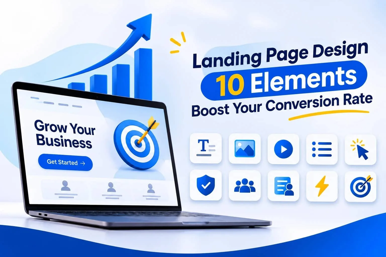
10 Landing Page Elements To Double Your Conversions
Below are the elements that will make your landing page convert well. Take a look:
1. Clear & Strong Headline
Your headline is the first thing someone will see. Some won’t even read past this. Keep it short (8-10 Words) and include the benefit. ‘Best Dental Clinic’ doesn’t tell them anything, whereas ‘Painless Dental Treatment – Book your Appointment Today’ tells them exactly what they will get. Within 2 seconds, they need to know what you’re offering, and if not, they will leave.
2. Subheadline & Value Proportion
This should support your headline. Keep it short and to the point. Just one or two lines. In this short section, tell your customer what you offer, who it’s for and why it’s better than anyone else. Don’t use any complicated words. Can you summarise your value proportion in one sentence? If not, you are not ready. Change it.
3. Hero Image/Video
Your hero section is the first thing they will see. Use a real image of your product/service. Avoid using generic images as users will instantly know they’re fake. Using a real image of your team/office/product will help much more. You can also use a short video. Whatever you choose, make sure it’s saying the same as your headline.
4. Benefit Orientated Content
Customers don’t buy features – they buy results, so don’t say ‘24 Hour Support’. Say ‘Get help at midnight so you never lose a customer.’ Keep your sentences short. Avoid long paragraphs. Use bullet points if needed. Use ‘you’ language. They will care about their problem.
5. Strong Call To Action (CTA)
Your CTA button will decide if they complete the action. Avoid using the word Submit. Use a strong CTA button such as ‘Get My Free Quote’ or ‘Book My Consultation’. Use a strong colour. Use one CTA button near the top and one at the bottom. However, only use one main CTA. Too many buttons will confuse the user.
6. Social Proof
People trust people. Include testimonials, Star ratings, Client Logos and Case Study stats. Use real names and images. Even just including ‘Trusted By 200+ Businesses’ will help. If you make big claims without any proof it will come across as noise. By adding proof it will turn your doubters into converters.
7. Simple Lead Form
The fewer fields you have the more leads you’ll get. This rarely goes wrong. Only ask for Name, Phone & Email. The more fields you have the more reasons they have to leave. You can ask for more details when they call. Include a line of text near your form to let them know what will happen next. ‘We will call you in 24 hours’. They will feel more comfortable.
8. Trust Signals
Whereas social proof proves other people love your trust signals prove you’re safe. Use Security Badges, Money Back Guarantee, Certifications and a clear Privacy Statement. They may seem small but they will help to remove any major doubts. Especially if you’re asking for money/personal details. Every user will think, ‘Is this safe?’ Answer this question for them.
9. Quick Loading & Mobile Friendly
Over 70% of traffic comes from phones. If your landing page is taking over 3 seconds to load many will leave. Optimize your images. Remove any extra scripts. Make your buttons easy to click. If you’re struggling with this, talk to a professional Web Development Agency in Delhi. Quick-loading and mobile-friendly landing pages are no longer optional. It will directly affect how many leads you get.
10. Consistent & One Goal
Make sure your landing page is consistent with your advert. This is called consistent messaging. If your advert says you’re offering 50% off on Web Design and your landing page has general introductory text, it will make them feel tricked, and they will leave. Make sure the headline, offer and design are consistent with your advert. Remove your menu. The more links you have the more exit points you have. A good PPC Agency in Delhi will be very strict with this as this is where your advert will pay off or not.
Best Practice
Make sure you follow these best practices:
1 goal – Don’t mix up your offers.
White space – Too much going on will make users feel stressed.
F/Z Shape – Users will scan in this format.
Scannable – Keep headings and paragraphs short.
Consistent – Keep colours, fonts and tone the same.
Design for mobile first. If you’re worried about the technical side, a Web Development Agency in Delhi can produce clean code and quick pages. If your code isn’t great, your beautiful design will be slow.
Common Mistakes & Fixes
Some mistakes will creep in and stop you from getting the most out of your conversions. Below are common mistakes, how they impact your conversions and how you can fix them.
Common Mistake | Impact on Conversions | Solution |
Too many CTAs | Visitor gets confused | One primary CTA per page |
Slow loading page | Bounce rate goes up | Compress images, use fast hosting |
Generic stock images | Trust drops | Use real product/team photos |
Weak headline | Visitor leaves immediately | Benefit-focused 8-10 word headline |
Poor mobile layout | Mobile leads are missed | Mobile-first responsive design |
Long lead form | Form abandonment rises | Keep only the necessary fields |
The hardest to fix yourself is the speed and mobile friendly. A Web Development Agency in Delhi can help you fix this quickly. Use this as a checklist for your landing page design.
How To Increase Conversion Rate With A/B Testing
Once your page is live, start testing! A/B Testing means you will have 2 versions of your page. Test your headline, CTA text and form fields. However, only change one thing at a time. If you change multiple things you won’t know what worked.
Try using an alternative to Google Optimize. VWO is a great one to try. Use Heatmaps from Hotjar to see where users are clicking. Paid traffic will speed up your testing, so it makes sense to work with a PPC Agency in Delhi. Small improvements will add up, and you will see an increase in your landing page conversion rate.
Conclusion
Overall, having a strong headline, clear subheadline, real hero image, benefit-based content, strong CTA, social proof, simple form, trust signals, quick mobile page and consistent messaging will all help create a high-converting landing page. All these are small elements, but all together they’re powerful.
Open up your current landing page and go through this checklist. How many elements are you missing? Slowly improve your landing page. If you want expert hands, we’re here! A Web Development Agency in Delhi can help you with your speed and mobile friendliness. A PPC Agency in Delhi can ensure your ad spend is giving you real results. Don’t overlook good landing page design; it’s the cheapest way to get more out of your traffic.